
True Colors
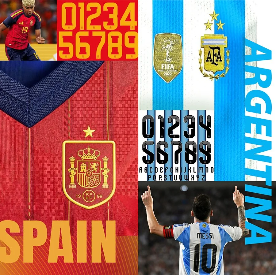
I'll admit that I'm unexpectedly invested in the World Cup. I'm no expert. I couldn't tell you much about tactics or formations.
But I am a branding guy. Watching Spain and Argentina reach the final, I've found myself paying as much attention to their identities as their play. They're both beautifully designed, but in completely different ways.
Spain feels bold and expressive. Argentina feels timeless and understated. Neither is trying to look like the other. Maybe that's why they both feel so authentic. Their visual identities reflect something deeper about who they are.
It makes me wonder how many businesses miss that opportunity. Not because they have a bad logo, but because they've lost sight of what makes them distinctive.
One of the things I love most about design is its ability to communicate identity before you read a single word.